
Medical students applying to residency often have to grapple with an incredible amount of information when evaluating prospective training programs. The increased number of applications and interviews inherent to the Zoom era further exacerbates this issue. At the same time, programs need to find ways to communicate a great deal of information to applicants. Due to the proliferation of social media, this communication is both more extensive and more longitudinal than a one hour presentation on interview day.
The traditional interview day presentation is a slide presentation that provides several factual details about a program. While each program is slightly different, most of these presentations cover common ground - including where residents rotate, what services they do, where alumni match into fellowship, examination pass rates, and information on professional development and research activities. These presentations can often be long (I once helped edit a slide deck that had 60 slides in it!) and difficult to recall. Furthermore, updating these slides from year to year is a time consuming challenge. Finally, most of these presentations are done in a traditional bullet point format with few slides reserved for photos. Few are designed in a way that optimizes user experience.
In my opinion, the most important quality of the program is how well a prospective applicant fits in with the resident culture. Though it is impossible to put into numbers, it has an outsized impact on a resident's experience and wellness. Furthermore, it is even harder to intuit in the absence of an in-person interview experience. Nevertheless, there are important quantitative metrics that applicants consider and programs want to showcase. However, there is not yet a standardized, accessible, and visually appealing format to do so. Given the challenges in communicating these details as well as the growing power of social media , I wanted to design a new way that programs can effectively and efficiently display and disseminate this information so that applicants can be more informed and programs can better utilize their interview days to convey the critical intangibles.
In the distinct but not quite distant field of surgical research, the visual abstract has already proven to be an excellent means of distilling a research study filled with details into an easy-to-digest and visually pleasing format. Developed by Dr. Andrew Ibrahim and colleagues, the visual abstract has already been adopted by 50 journals, and a study by the creators demonstrated that the presence of a visual abstract can more than double article visits and increase impressions more than seven-fold. An excellent primer discussing how to develop a visual abstract and highlighting its use in academic journals is available here.
A variant of the visual abstract has also been used by residency programs on social media in the past. An example from the Duke Surgery Residency program is shown here:
We’re so excited to meet #GenSurgMatch2023 applicants over the next few months! Check out our latest @DukeSurgRes #VisualAbstract #ByTheNumbers. We hope you can visualize your #SutureFuture at @DukeSurgery. #SabistonSquad #SurgTwitter #MedTwitter #SurgEd #ILookLikeASurgeon pic.twitter.com/6ZqnfFrWE5
— Duke General Surgery Residency (@DukeSurgRes) November 1, 2022
Inspired by this format, I tried to design a version tailored towards prospective surgery trainees. I wanted to see if I could boil down the complexity of a program into the fewest pieces of data possible and present them in a user-friendly interface.
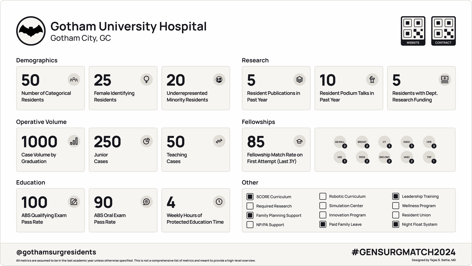
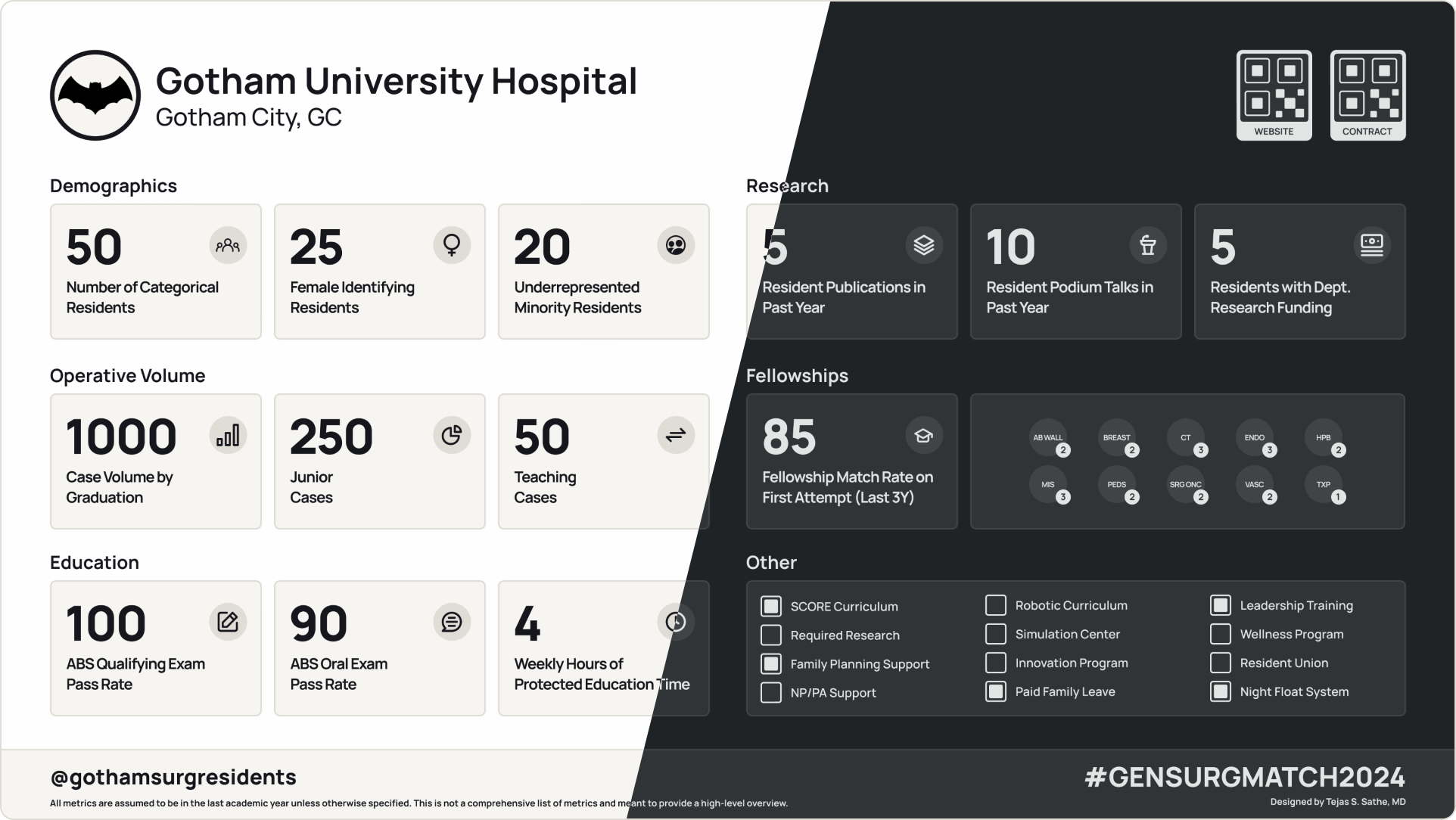
The Visual Abstract
The abstract contains six different categories: demographics, operative volume, education, research, fellowships, and other. The goal is to capture relevant information regarding the tripartite mission of academic surgery as well as understand a program's strengths in diversity and inclusion and career preparation. For each category, discrete data points were chosen which can easily allow applicants to contextualize a program's strengths and weaknesses. The other category contains a checklist of features that applicants seem to care about (based on observations and conversations though certainly not proven scientifically). Finally, there is a space for QR codes to link to the program website as well as a copy of the contract that matched applicants will need to sign (as required by the National Resident Matching Program).
Of course, the tool comes with a dark mode!
What this is
This visual abstract can provide a semi-standardized format for programs to share important information with applicants allowing them to compare important metrics in a comprehensive, “easy” way. It is important to note that each of these data points is meant to be an objective measure without any comment on its intrinsic value. For example, one program may have a significantly higher case volume than peer institutions but less protected education time. Another may have a robotic curriculum but not have any recent chiefs who matched into Pediatric Surgery. None of these are independently good or bad, but applicants should have an easy way to understand the factors so that they can make the most informed decision. If a significant number of programs adopt the visual abstract, it will naturally create incentives for programs to share and improve on these metrics with transparency. In this manner, healthy competition can actually generate an incentive to improve program offerings for current residents as well (though this can have unintended consequences…see limitations).
Some may question the wisdom of putting these numbers out in the open - especially if they are not where a program wants them to be. However, some of the information is publicly available. Many of these data points are already reported on during the interview process. Moreover, most applicants want to know this information and value transparency. Ultimately, no program is perfect, and how a program chooses to address perceived strengths and weaknesses reflects its core values.
What this is not and other limitations
No visual abstract, slide deck, or document will be able to capture the full picture of a residency program - which at its core is a collection of human beings. It is worth repeating that the most important consideration students should make when choosing a program is missing from this work. Furthermore, the exact data points used may not be correct. At one point, I considered putting a box for ABSITE pass rate, however I thought this was antithetical to the ABSITE's stated aim of being a formative, not a summative, assessment. Furthermore, there is no box specifying the number of LGBTQ residents in a program. While this is an essential component of diversity, equity, and inclusion, it was omitted due to the fact that some of these residents may not be publicly out and this would lead to an inaccurate representation. Another missing box is the number of residents with children, given that family support is an increasingly recognized feature that students are looking for in training programs.
I would like for this to be even less cluttered - and user feedback can drive further reduction of content such that the distilled final version is even more elegant. Currently, the vision for this project is that of a grassroots project, where individual programs can choose to use, improve, and modify this template to broadcast important information to applicants. However, I am wary of the general principle that once quantitative metrics are used by a central authority to rank, there is a natural tendency to gamify those metrics whether or not the underlying feature they seek to estimate is actually affected.
What to do with this template
In short, whatever you would like. The template was built in Figma, which has become the industry-standard in visual design. It is free to make a basic Figma account, and the full suite of features is also available for free with proof of affiliation with a university. Figma offers the ability to comment on a template as well as duplicate or "remix" the template for personal use. I would appreciate your feedback on how to make this template better. Moreover, I encourage you to take it, modify it, improve it, and share your changes publicly. Together, we can continue to iteratively design this initial prototype and develop a robust, user-friendly tool that provides values to students, residents, and programs alike.